Friday, April 19, 2013
Little Shack...Oil Painting
This is a painting that I sold recently through my wonderful gallery in Jackson, MS. It is on its way to a new blues and barbecue restaurant on the East Coast. I think it will fit in quite nicely in that setting.
Labels:
blues,
country,
shack,
southern scene
Thursday, April 18, 2013
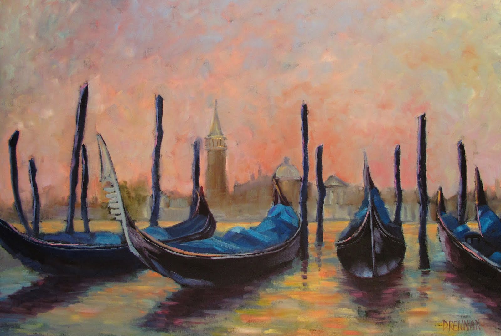
New Oil Paintings.....2013
Here are some examples of my new work for Spring 2013. All are for sale unless otherwise marked. If you are interested in purchasing one of these original oil paintings please enquire by email for sizes and prices. All are on 1 1/2" thick gallery wrap and are painted on the sides (and there are no staples). They come wired and ready to hang with no framing necessary unless you choose to go that route. Thanks for looking at my work!
Labels:
Italy,
musical instruments,
musicians,
New Orleans,
oil paintings,
oranges,
red wine,
Venice,
waterscape,
Wine,
Wine bottles,
wine still life
Saturday, June 9, 2012
Birth of an Oil Painting.....Happy Birth Day.
This is a photo of my finished commission for my client in Missouri....still wet on the easle.
Yes, I am happy happy happy and I hope the owners will be as well.
That glass looks like you can pick it up and drink out of it (if it wasn't empty!) I added the little marks that make the glass on the wine glass and the salt & pepper shakers come to life. Mostly the less you can add and the more you can imply the better off you are where glass is concerned.
The lable on the wine bottle is another favorite spot for me. My client sent me a bottle from one of his favorite local wineries in Missouri. At the bottom of the lable in tiny letters you can read Hermann MO. How personal! My goal with lables is to have them just realistic enough that they are not just generic, anonymous spaces....but not so bogged down in detail that you can read everything word for word. I want them to evoke the image, but not photocopy it.
What I try to create is what I told my client in an email...A blend of a very representational piece that is very literal at first glance but then if you look you see the basic "loose-ness" and "expressiveness" that is the root of impressionistic painting. That is why I love the little imperfect parts...messy edges and the sides of the bottles and the s & p shakers that are not totally matchy-matchy. This is what keeps you looking at a painting long after your eyes have told your brain that this is a painting of some bottles and stuff on a table.
That is why I paint.
Yes, I am happy happy happy and I hope the owners will be as well.
That glass looks like you can pick it up and drink out of it (if it wasn't empty!) I added the little marks that make the glass on the wine glass and the salt & pepper shakers come to life. Mostly the less you can add and the more you can imply the better off you are where glass is concerned.
The lable on the wine bottle is another favorite spot for me. My client sent me a bottle from one of his favorite local wineries in Missouri. At the bottom of the lable in tiny letters you can read Hermann MO. How personal! My goal with lables is to have them just realistic enough that they are not just generic, anonymous spaces....but not so bogged down in detail that you can read everything word for word. I want them to evoke the image, but not photocopy it.
What I try to create is what I told my client in an email...A blend of a very representational piece that is very literal at first glance but then if you look you see the basic "loose-ness" and "expressiveness" that is the root of impressionistic painting. That is why I love the little imperfect parts...messy edges and the sides of the bottles and the s & p shakers that are not totally matchy-matchy. This is what keeps you looking at a painting long after your eyes have told your brain that this is a painting of some bottles and stuff on a table.
That is why I paint.
Friday, June 8, 2012
Birth of an Oil Painting....WIP 3
Here is the next installment in the process painting series of my Missouri commission. I emailed the owner of this painting and told him that sometimes I stand in my studio and hold some palette knives and God paints a painting.
That what is happening here. It seems to be flying onto the canvas.
When you first approach a blank drawing on a canvas, you need to block in colors in the correct values with the idea of getting the entire canvas covered before you start making drastic changes. Everything is relative to what is next to it and you can't really judge till you have all the black covered up. If you are lucky, though, some of those rough little patches that you just spontaneously blocked in will stand the test of time and become permanent parts of your painting.
A successful painting to me is one that I have the fewest places that I have to come back and re-work what I did on the block-in. I can already see some little permanent parts starting to show up at this stage...Like that lid on the olive oil! Can't you just reach right up there and unscrew it?
Here I just about covered up the black...just the salt & pepper lids and parts of the sides remain uncovered. The glass doesn't have a top rim yet, but already I am LOVING it! (My daughter viewed this after I had stopped for the day and called it to my attention that the glass that I was loving so much did not have a base on it! Lol... sure enough it was levitating.)
I will fix that and add all those little cool things that make a painting come to life tomorrow when I will show you the last photo of the finished product!
Labels:
olive oil,
salt and pepper,
still life,
white wine,
Wine,
Wine bottle,
wine glass,
wine paintings,
wine tasting.
Thursday, June 7, 2012
Birth of an Oi Painting....WIP 2
This is the second of the series of my process paintings for my Missouri commission. I prime my canvases in black acrylic and the my rough drawing is done in chalk. It is easy to change huge mistakes with the chalk and it shows well on black. I even sometimes use several colors of chalk on a very complex painting to help me keep different buildings or groups of trees sorted out for the painting part.
I strive for a loose style, so I keep my drawing very basic. I want the spontaneity of the painting to come through. I admire the talent it takes to produce very realistic, almost photographic, paintings. I have even done some in the past that people have mistaken for photographs. But that is not the style that I am drawn to. I like bold, loose, chunky and funky. I am still working in that direction.
At the beginning of this painting I blocked in my lightest lights...the salt, garlic and wine lable. And then I sort of just keep moving...painting on what strikes my fancy. There is no one process that I use. My goal is to not get too bogged down in one spot and work an area to death. I sort of flirted with that issue here on the wine bottle...working a little too close to finished on the bottle itself. But I do like to get those highlights incorporated into the paint around them before the paint dries too much.
At this point I was happy with my start and looking forward to continuing! More tomorrow.
Labels:
Oil painting,
olive oil,
salt and pepper,
still life,
white wine,
Wine,
Wine bottle,
wine glass,
wine paintings
Tuesday, June 5, 2012
The Birth of an Oil Painting...WIP
I am going out on a limb here by letting everyone in on this project from the very beginning. I have just received the go-ahead for this commissioned painting. This is the photograph that I will be working from. I thought I would share the on-going process with the future owner (he lives in Missouri and I live in Mississippi, so he and his wife can't just drop in to check on the progress). Since I was going to be sharing it with him, I thought I might as well share it with my blog friends as well.
This started as a request, back before Christmas, by my former client (who found me through Google, by the way) for a 24 x 24 painting featuring salt & pepper shakers. It evolved over many emails and photos into the composition that you see above.
I had the components all gathered and took MANY photos of them in all sorts of arrangements and none of them suited me. I just could not achieve the balance that I was looking for. Then yesterday I moved my light source slightly forward and BINGO! Those two gorgeous shadows were thrown on the back and harmony was achieved!!!!
My shot-gun approach to good composition sometimes takes a while, but I know a good set-up once I see it. Sometimes you just have to kiss a lot of frogs along the way.
I am off to begin the drawing process...photos of that tomorrow!
Monday, May 28, 2012
Asparagus Bunch...Oil painting
8x24....oil on canvas
This is a first time painting of asparagus. I love it and plan to paint more. My favorite part is the purple rubber band. Not sure why, but it is.
On another note...As we pause to thank our veterans I have cause to think of another group of people that deserve our thanks...our often overlooked teachers! I had the distinct pleasure of talking to my junior high school (to you young people, that's what we used to call middle school) art teacher a few minutes ago.
I think of her often and in teaching my recent workshop I realized that some of the art principles that I was teaching to others were little gems that I had picked up way back when in her class in the 70's. I decided to look her up and tell her thank you for the impact that she had had on my life. I'm glad I did.
So to all the teachers out there....whether your students are able to find you to thank you or not....remember that most likely there are scads of former students out there that think of you often.
So once again, Thank you Ms. Swager!
Friday, May 25, 2012
Crab-i-liscious....oil painting
16x20......original oil painting on canvas
I love this painting, and it is one of my first to feature a more realistic colored crab. I was really digging my awesome colorations...and then my husband mentioned that once the crab is cooked...as it would be when you actually put it on a PLATE....they turn orange. Oh, yeah, they do, don't they? Oh well, lol. I still like it.
Wednesday, May 23, 2012
Market Fresh...original oil painting of FISH
24x24 ....oil on canvas
This is my favorite of my new paintings this spring! I love the colors and the unique-ness of the subject. In person, this one has great depth and presence. If it was a floral painting, I would say you can almost smell it, but with this one, well, you know......
Labels:
art for men,
bold,
catch of the day,
coastal,
colorful,
fish,
fisherman,
fishing,
seafood
Tuesday, May 15, 2012
Shrimps for Dinner....Oil Painting
I love this painting. It is 16x20 oil on canvas and I just love it.
It is New Orleans....it is summer....it is friends....it is eating and having fun....messy hands....hanging out and laughing...everything I like about the South.
I was talking to my daughter at a recent art festival and I said..."I just love how this painting turned out!" I told her "I love the shrimp, and the wine glass, and the checked tablecloth! and the corn, I LOVE the corn! and the olive oil bottle!"
She said, " It sounds like you pretty much like everything about this painting!"
I said, "Well, the plate's ok"
Then I decided I really like it too!
Subscribe to:
Posts (Atom)